4 key principles of web design
If you’ve ever researched web design principles, you’re probably more than familiar with the following attitude: “Web design is just so easy these days. With lightning-fast internet speed and sophisticated browsers, designers hardly have to deal with any of the restrictions that shaped the early days of the web. A website is, more than ever, a designer’s canvas.”
This may be true enough from the perspective of someone already comfortable with the basics, but if phrases like “CSS responsive grid system” and “Google Web Fonts” are alien to you, then jumping into the supposedly “oh-so-easy” world of web design may still seem a daunting proposition.
In recognition of this, we put together a truly basic set of web design basics with the beginner in mind. Of course, it’s never a bad idea to review the fundamentals, even if you consider yourself a wiz.
1. Grid systems
_
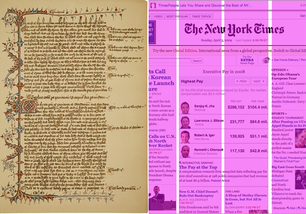
Since the invention of the codex in the 1st century, the grid has determined how we read. Thousands of variations, involving different arrangements of rows and columns, have emerged over time.
Think of the way text and images are arranged in books, newspapers and magazines. These are the systems that were more or less directly carried over onto the web, and they work. Word to the wise: many a designer has attempted to avoid the grid in the name of “creativity”; many such websites go unread.
In a world where people are as, if not more likely to browse the web on phones and tablets than on traditional computers, the issue of “responsive design”—designs that translate to smaller screen sizes in a smooth and intentional manner—is also paramount.
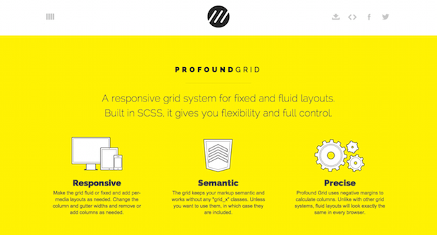
To make our lives easier, a huge number of pre-fabricated grid systems have emerged which are responsive, compatible with major coding languages, and generally free to download.
Some popular ones are 960.gs, Simple Grid and Golden Grid System, but the list of good options is truly enormous, with some being more complex than others. Here’s a good article from WebDesignerDepot to get you started.
Of course, if you’re feeling adventurous or feel your project demands a truly unique solution, then by all means, create your own.
2. Visual hierarchy
_
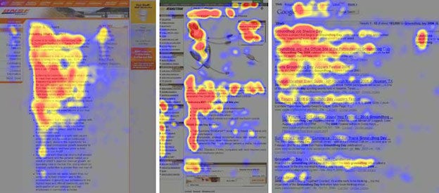
We recently wrote a full article on this subject, so we’ll be brief here. Basically, it’s a known fact that in most cultures, people read left-to-right and top-down. However, it is also a known fact that, within these parameters, reading behavior follows a much more complex set of rules. This is especially true on the internet where people actually “scan” pages much more than they “read” them.
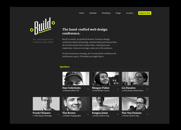
Good web pages are built in response to these measured reading patterns by placing important elements, like the logo, call to action or a key image, along the axes that the reader is expected to scan. These conventionally take either an “F” or a “Z” shape.
Beyond that, visual hierarchy is about signaling to readers what should be read first and what should be read next. After page placement, this may involve strategies like font size, spacing, direction and typeface pairing, as well as the use of color highlights.
3. Web-safe fonts
_
In 2014, the term “web-safe fonts” already feels like something of an anachronism. Back in the early days of the internet, browsers supported a very limited number of fonts—typically just ones that were already installed in users’ word processing software—and if you deviated from these, some visitors would just wind up seeing random symbols.
Today, it is still true that certain fonts are supported by most browsers while others fonts are not, but the number of web-safe options has exploded thanks to the adoption of what is known as @font-face embedding in most modern browsers. Indeed, many designers complain of having too much to choose from.
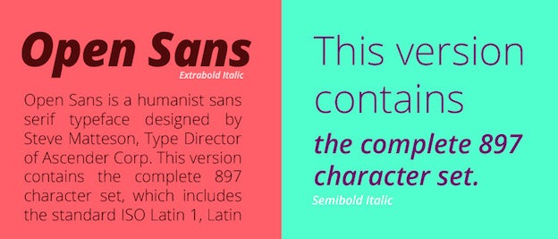
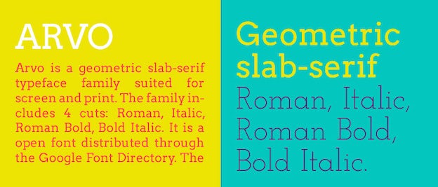
Fee-based font services include Typekit, WebINK and Fontspring. You can find nice free fonts, too, if you do a little searching through free services like Google Web Fonts. Here is a recent roundup of nice free web fonts by CreativeBloq.
Now that you know where to look, there are just a few general rules to keep in mind:
- Serif fonts are for headlines
In web design, serif fonts are always reserved for headlines, because at smaller sizes they become hard to read. Body text should generally be sans-serif. - Keep fonts minimal
To reduce clutter, keep the number of different fonts on a website to a minimum. Two or three at the most. Check out our recent article on smart font pairing for more information. - Don’t take up too much space
Remember that some font files can be pretty enormous, and this could potentially slow the load time of a website.
4. Images and colors

The principles of image and color placement are not especially unique to web design, so we won’t go into too much depth here. The main maxim to keep is: don’t overdo it.
For colors:
- Keep your color palette minimal
Like fonts, just stick to 2 or 3. They should